


click a poster to learn more!


Artist Merchandise Poster
This was a passion project made for a music artist I like, inspired by the lyrics of her songs. I wanted to evoke a light and airy feel by utilizing soft yellow tones that the viewer would associate witha subtle joy. I intentionally chose the arch shape in order to remind the viewer of an open window, inviting them into the piece. The four pointed stars were chosen to give it a youthful and cozy look.


Vermeer Poster
I made use of public domain images with a Creative Commons license for this piece. The painting Girl With A Pearl Earring by Johannes Vermeer is a painting that I admire a lot-- this poster was a passion project. I retouched the images in order to fit the composition and atmosphere of the piece. The text is pulled from a lyric by the singer Laufey; it's something I find myself and many people my age identifying with. I chose the colors to reflect the central message.
Angels and Authority
This piece was part of a collection of others exploring the motif of angels and control. The other pieces featured on my website can be found here and
I pulled from the Met's gallery of free-use photographs, from lyrics of a song, and from my personal library of vector graphics. I also love the halftone and ink-block texture used here.


Billie Holiday Poster
My client, a musician, requested that I use burgundy and deep reds for one of her favorite artists. I chose the shades to give the piece a more intimate and passionate feel, but I struggled to choose fonts that match. Jazz is often sophisticated and full of
spirit, and I chose two fonts that I felt were complimentary and conveyed that. I tried to evoke a more vintage feel through scanned prints made vector, but given another opportunity, I likely
would have given them more texture. I am most proud of the layout and composition of this piece.


Agency Poster
The quote, split into the corners, was the main inspiration for this piece. I wanted the viewer to understand that people have the power to save themselves. I used a photographed sword with a Creative Commons license in order to create the central focus of the piece. I retouched the colors and image to give it a more dramatic look; I wanted to complement the red. The textured background and shape of the red is meant to give it a dynamic, bloody look, while the sharp edges of the white are meant to depict a sort of divine radiance. I chose the font to match the serious, formal atmosphere.
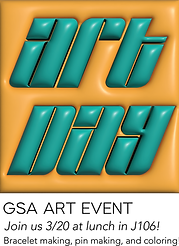
Typography Flyer
My teacher assigned me to make an ad for the program I am currently enrolled. I decided after sketching that I would make a visual pun--
"read between the lines." I wanted to emphasize the emotional learning that underscored the technical
skills through a physical representation. I picked orange because it's often associated with courage or passion, both needed to apply to the program. I carefully chose the fonts to be informal but elegant. I had trouble executing the composition of this piece
